
I’ll be honest, Gangs of London is not a good name – it’s boring and generic. Thankfully the show and key art is anything but, the latter being what drew me into watching the show in the first place – certainly not the terrible title. Created in-house at Sky Creative, the key visuals for both seasons perfectly capture the characters, themes and mood of the show.
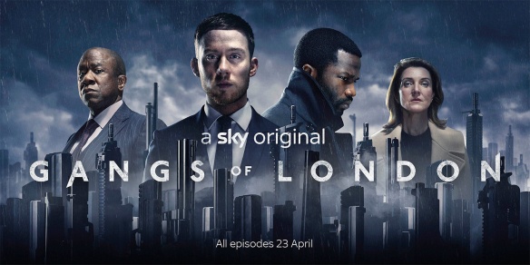
As with all big cities, London has an absolutely iconic skyline and so it comes as no surprise that this be used as a key focus in this artwork. The twist comes when you realise that these aren’t in fact buildings but guns, each of their unique forms and colours granting the initial illusion. Delving further into the meaning behind their inclusion, this Sky Creative case study reveals their allusion to how organised crime launder their money through building high-rises, an aspect commonly explored within the show itself. The mood is darkened further with a hanging smog below which, on reflection, could equally be as a result of gunfire. Looming above the city are some of the major players in the show, a severity and weight present in their expressions. Topping things off, a bank of storm clouds gather overhead, pouring rain and foreshadowing the chaos to come.
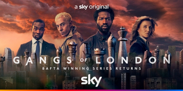
The strongest component of the season two key art is how it maintains the composition and themes of the first, making it immediately recognisable. Marking his progression through the ranks, Elliot is now front and centre with new characters also added to the line-up to intrigue fans and newcomers alike. In line with this shift in standing, and the increasingly diverse number of gangs operating in the city, the guns have been replaced with chess pieces. Dotted amidst regular buildings, I love how the different pieces have been transformed into architectural marvels, the sheer contrast to the ordinary demonstrating the power dynamic between rich and poor, gangster and civilian. In a dramatic shift from the cold blue tones of the first season, this visual adopts warmer shades courtesy of a dramatic red sky. Sadly, as anyone that recalls the rhyme knows, this can signal both ‘delight’ and a ‘warning’ – an apt allusion to the rise and fall of rival gangs throughout the show.
An absolutely amazing series, easily my favourite of 2022, I can think of no better art to accompany the drama that unfolds within. With some of the best fight sequences I have ever seen (incredibly gory mind) and a cast of characters that will have you picking and switching sides throughout, I couldn’t recommend watching Gangs of London more. Well, maybe after any planned tourism…

You must be logged in to post a comment.